
What's it really like to work 'here'? Part 2

(Photo by Museums Victoria on Unsplash)
I love my work. Hmmmn, ok maybe not always. I should qualify - sometimes, I love my work.
One of the activities that count towards enjoying my work is getting to work with different clients and figuring out what's going on there. It is quite satisfying being able to quantify the engagement levels across an organisation, and then validate and interpret those numbers with the client.
The scores are often not a surprise.
But what's most useful is answering the question, why?
What is driving these outcomes?
Once we have the overall picture (read part 1 here), we can start to explore the relationship between the measures and the factors that are impacting those outcomes.
- 'Measures' are what we look for in engaged staff - outcomes like enjoy coming to work, sense of pride, advocacy, etc.
- 'Drivers' are elements that make up the employee experience - the working environment, our training, communication, interaction with managers and coworkers, and so on.
When everything is rosy, scores are higher.
However, if a score isn't where you expect or want it to be, check what else is lower?
Is it the same for everyone, or just one group or selected teams / departments? Then we look at what else is different and by how much, looking out for patterns. What do other elements reveal?
We might look at
- Communication
- The role of managers
- Teamwork, knowledge sharing
- Training
- Capacity and work-life balance
If the engagement score is low, for example, often something in these areas will reveal why.
In this example below, 'team C' is very different (much more positive) to the others. Co-operation and open to trying new ways... (lines 3 and 4) also have simillar size falls in team C as the others - it is evident that these factors impact on the employee experience.
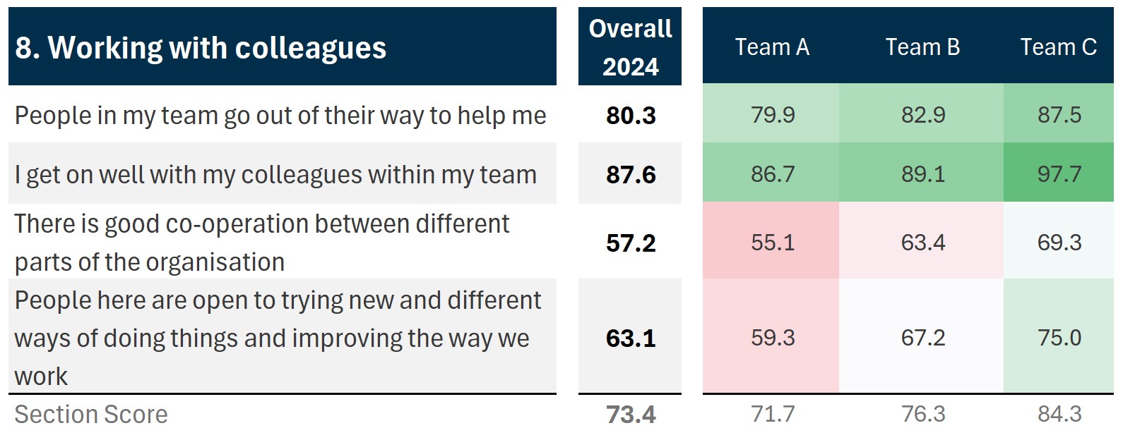
You probably have additional knowledge about the teams, and when you scan through the other questions and statements you will find other differences that build a clearer picture of how - and why - people feel about working here.
Some scores are naturally high scoring!
In the screenshot below are more scores from Surveylab's UK Workplace Study. For most of these statements, 80% of respondents answered Agree or Strongly Agree - producing these high scores (this is normal in most organisations).
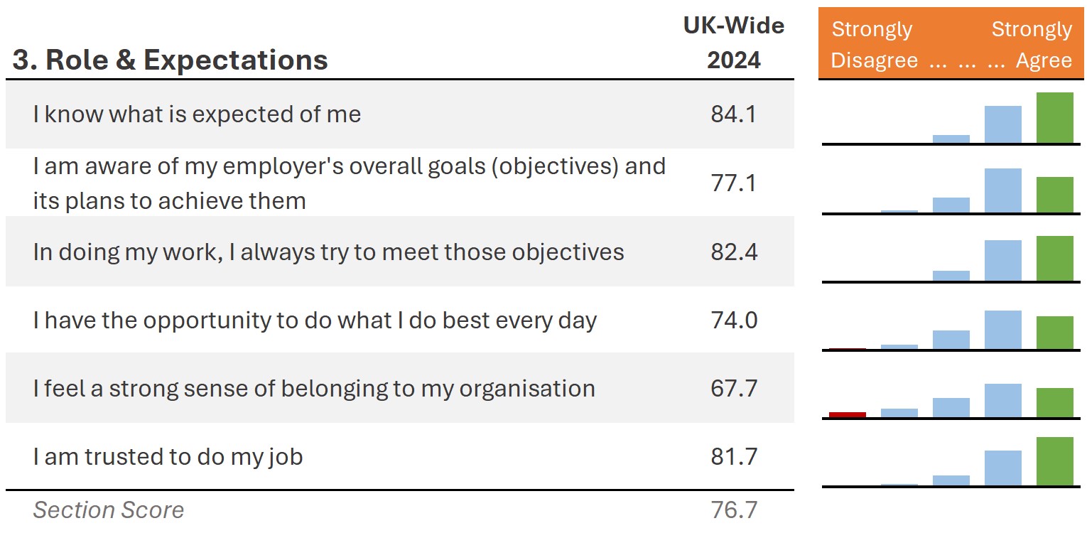
The statement I know what is expected of me - is an example of a hygiene factor. It is one of the drivers that are required as a basic requirement in the workplace, and it should be scoring highly.
Using our score index calculation1, if everyone answered at least 'Agree' (the second box on the survey scale), the score would be 75.0 or higher. So a score in the 60s or even low 70s indicates there are probably a number of staff 'sitting on the fence' about their work before they even get started.
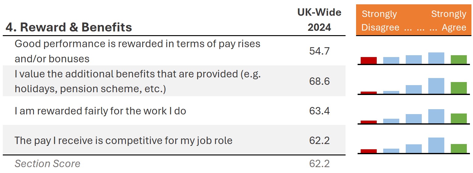
Is pay a factor?
At the other end of the scale, pay is nearly always a low scoring area in an employee survey. In our Surveylab's UK Workplace Study, it always features in the bottom 5 scores across the entire survey.
The table below shows the UK Workplace overall scores. Except for additional benefits, results for Public and Charity/not-for-profit Sector employees are between -5 and -9 points lower than Uk-Wide overall. Private Sector scores are about +3 higher. It's worth noting the study data loosely reflects the UK working population demographic profile across all industry sectors and by age, gender, region, income.
If pay is an issue in your organisation, your scores will stand out. That said, if something else is at play - sometimes the finding that pay isn't in the bottom 5 scores increases the attention to those that are the lowest scores.
Go back and read part 1 here - what's it really like to work 'here'?
How does your employee experience measure up?
We can help with your next employee survey. Contact us