
Is a score of 3.7 good?
Maybe! Dan uses some of Surveylab's UK Workplace Study data to show three ways to present your results and when you might want to use each approach.

Which sounds better?
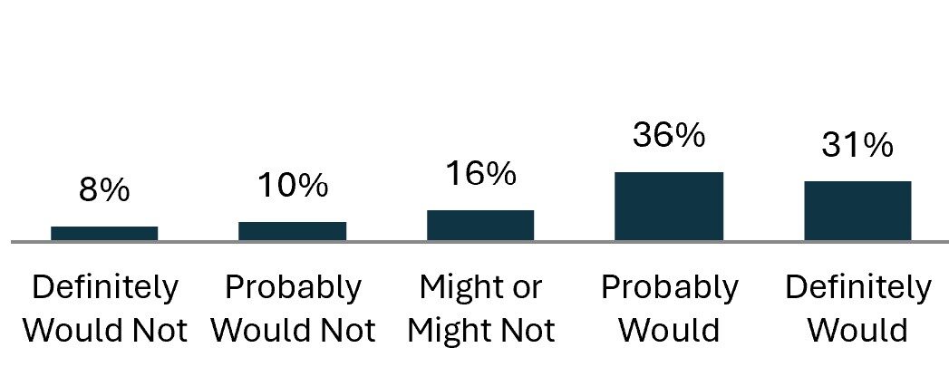
- 31% of employees would definitely recommend their employer as a place to work
- 67% of employees would recommend their employer as a place to work
These results come from Surveylab's 2024 UK Workplace Study - across the UK, all industries, ages, sex and region. Almost 1/3 of employees definitely would recommend, and a further 1/3 employees probably would recommend working for their organisation:
Which figure should you use?
It depends. What are you trying to achieve?
If you have a lot of 'fence sitters' and the organisation is in the early stages of working towards a better employee experience, then reporting the 'top box' (those definitely answers) may be seen as hard to reach or doesn't reflect how it is for the rest of us.
If results are consistently very-very good and you are trying to maintain excellence then using the 'top box' figure might be more appropriate (well done btw).
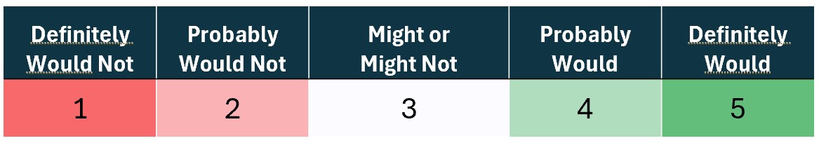
The other option is to create a score. Each answer is worth between 1 and 5 points, then you can calculate the average answer using this scale below (so the likelihood to recommend result above scores 3.7)
3.7 out of 5 is quite good then?
Maybe. Can we make it easier to share and interpret survey results?
How to present survey results
There are three common ways employee survey results are presented:
Option 1. Show the breakdown of answers, perhaps with colour-coding to draw out where consensus lies:
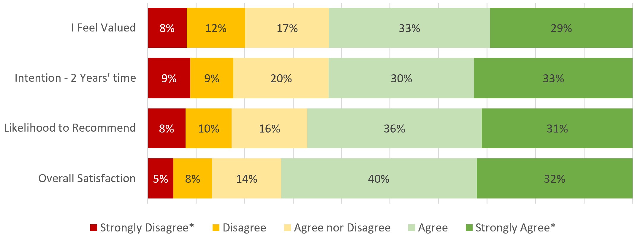
I like this presentation because it shows all responses received to each question. The chart above shows four measures and in this example the results are fairly consistent between these four measures, which helps to draw conclusions. But the drawback is this is hard to read when the % breakdowns vary a lot, making it very difficult to compare. This also applies when you compare results between multiple teams, locations or other demographic groups.
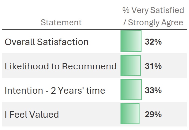
Option 2. Show only the proportion of 'top box' answers, i.e. report how many are completely on-board:
When I am presenting or talking about survey results, I will often pick out a single breakdown as a highlight - say "one third of all employees strongly agree, that they plan to be working here in two years time".
However, I'm not a fan of just reporting the top answer (or top two). It leaves the reader asking, what about the others?
Reporting a single number (Scores)
Option 3. The last approach is to convert the answers into a score
Typically between 1 - 5, sometimes 1 - 7 or on a 10 points scale.
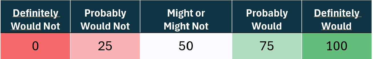
At Surveylab, we use this last approach, with a twist. Even though most of our surveys use a 5 points scale, we assign scores between 0 and 100 to each answer option. The least desirable answer is assigned a score of 0, then 25, 50 for the middle answer, 75, and the top box is worth 100, like so:
Applying our 0 - 100 scale on the likelihood to recommend result at the top of this page, the average of all the 0s, 25s, 50s etc. is 68.3
I like this method because it includes
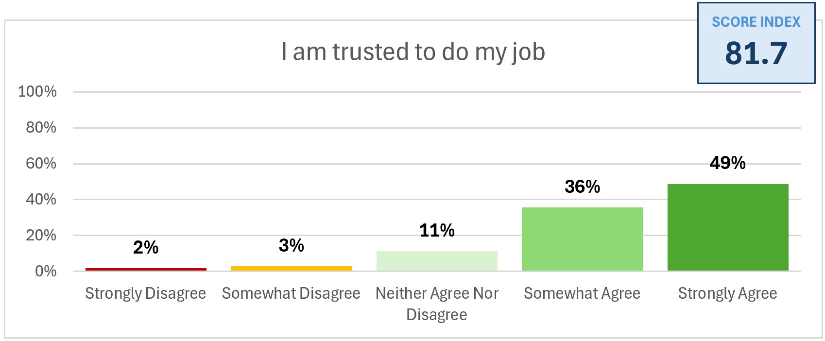
all responsesto the question (emphasis on all responses because this is important! Everyone's answer counts). Also, most people are familiar with understanding how a 70 or 80 relates to a score in the 50s. A score close to 75 or higher means mostly positive sentiment:
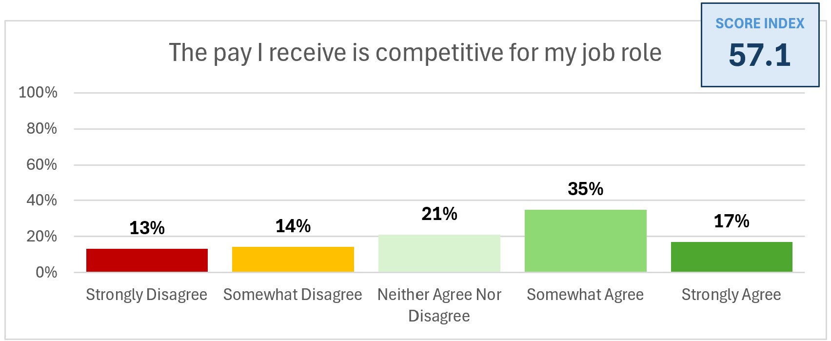
A score close to 50 might reveal a higher proportion of people 'sitting on the fence' (perhaps they don't know?). Although, more often than not it means views are split, with roughly similar numbers falling under the positive and negative camps. For example:
The main advantage of presenting a score over top box or all breakdowns is the simplicity in comparing numbers.
It is much easier to compare a single number from each team, a location or other demographic groups. There is a 20 points difference between the lowest and highest scoring groups here:
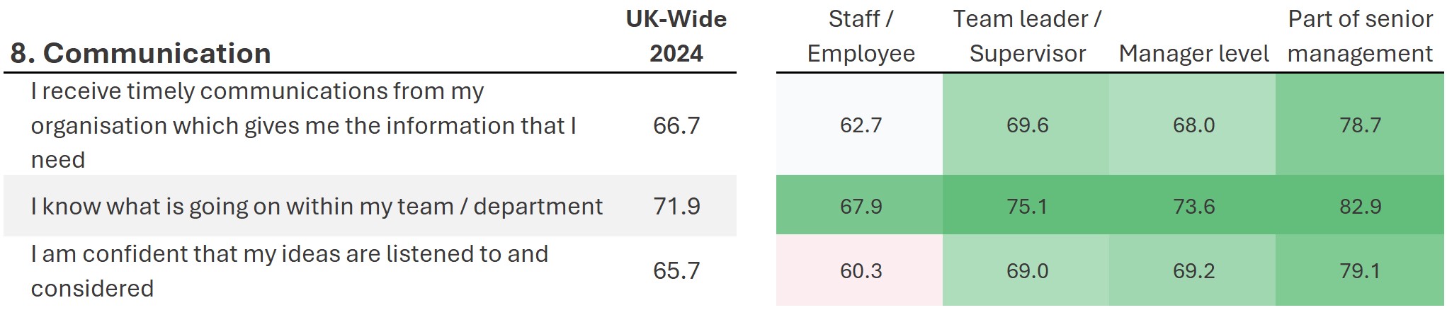
Amongst senior management, the scores indicate the answers are nearly all strongly agree or agree. The average score falls for middle managers and team leaders - still positive but not all. Non-managers are least positive - communication isn't always meeting their needs.
Make sense of your survey results
We enjoy getting stuck into employee surveys and other types of survey. Have a quick question or looking for expert help? Let's talk!
More reading: